Asset Class Performance after the Final Hike – Part I Equities
Historically, US equities have performed reasonably well to strongly after the Fed's final hike and until the first rate cut.
There’s a good chance that we have seen the final rate hike from Powell this tightening cycle. Economic activity is likely to decline, and we know from previous hiking cycles that unemployment starts rising after the Federal Reserve is done. Next, the US regional banking sector has demonstrated that it can’t take higher rates. First, because the pressure on deposits will further increase, and second, because duration-related (paper) losses will grow. In addition, headline inflation is set to tumble due to base effects and lower energy prices. Inflation ‘stickiness’ is the big unknown here, but given the arguments above, Powell will address this by keeping rates high for longer. Hence, it’s time to bring out the ‘what happens after the Fed is done hiking?’ analysis.
Beyond Equities
Contrary to many, if not all, of our peers, we will not only focus on US equities. We will analyze cross-asset returns following Fed final rate hikes, first rate cuts, and between the final hike and first cut. To keep things concise, we will split the research into two parts. This first part will focus on US equities since this gets the most attention from mainstream media, and some charts floating around on social media may paint a bit too rosy a picture. The second will also focus on returns on Developed Market Equities, Treasuries, Commodities, and Gold to present a multi-asset perspective.
What happens to US equities once the Fed stops hiking?
To answer this question, we calculate 1-, 2-, 3-, 6-, 9-, and 12-month returns following the final rate hike of every major Fed tightening cycle since 1970. The results are shown in the table below. With one exception, the average and median returns are positive for every holding period ranging from one to twelve months. However, the average returns following tightening cycles since 1970 are not that different from long-term historical averages. For example, the S&P 500 Index realized a return of 7.0% on average in the 12 months after the Fed put in its last rate hike of the cycle. This is very close to the long-term average return on equities.
However, if we focus on median returns – 12.8% for the 12-month period – equities have done better than average once the Fed stopped.
Cherrypicking?
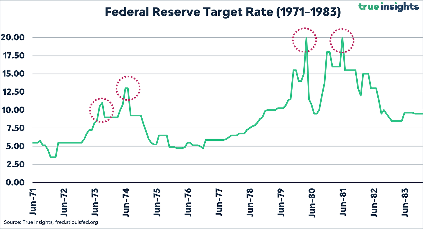
Determining tightening cycles is somewhat subjective, especially regarding the volatile period between the 1970s and 1980s – for a great deal characterized by the Volcker ‘trial and error’ approach to get inflation down. The chart below shows the Fed Target Rate between 1971 and 1983. It highlights two episodes, 1973-1974 and 1979-1980, raising the question of whether we are looking at one or two tightening cycles. Especially the 1973-1974 period may go either way because the rate cuts in between were relatively small before a new peak Target Rate was reached. But at least to us, the period 1979-1981 reveals two distinct Fed hiking cycles.
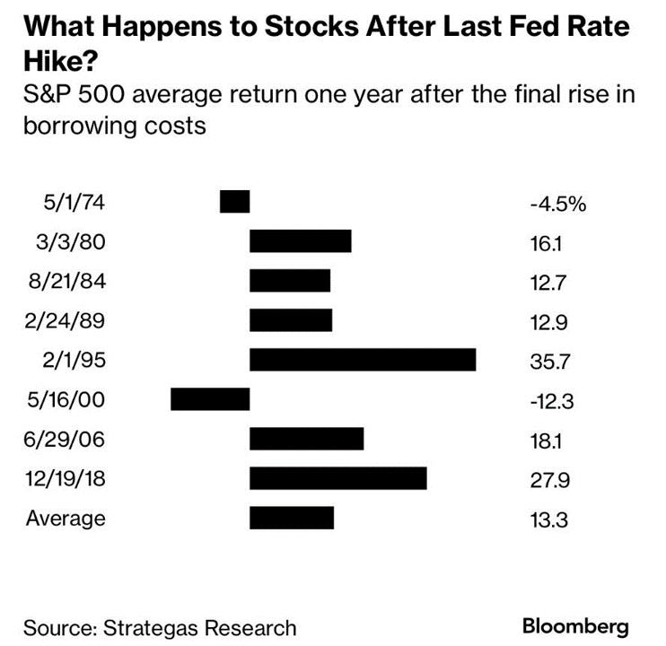
We highlight potential subjectivity because of the chart below. It, too, shows the 12-month return on S&P 500 Index following Fed final rate hikes, but it excludes the peak in 1973 and the second peak in 1980. On both occasions, the 12-month subsequent return was negative (-30.5% and -5.8%.) As a result, the average return jumps to 13.3%, instead of the 7.0% we find.
Outliers?
One could argue that the period 1971-1983 is an outlier altogether. As the chart above revealed, these cycles were pretty erratic, with big hikes and cuts following each other swiftly. In fact, in some cases, it was a matter of days before the Fed cut rates again after reaching the peak.
If we take these erratic cycles out and start the analysis in 1984, the outcomes are significantly more upbeat. Both the average and median 12-month S&P 500 Index return after the final rate hike are above 15%. The returns for shorter periods are strong as well. In summary, US equities have celebrated the end of more recent Fed tightening cycles.
What about rate cuts?
With markets expecting the Fed to cut rates as early as September – we think this can only happen if something breaks – we also looked at the S&P 500 Index returns following the first rate cut after the major tightening cycles since the 1970s. The results are shown in the table below.
Things look quite different. First, the number of negative average and median returns has grown. Especially in the first three months after the first rate cut – likely when markets realize the Fed did break something again – returns have regularly been negative. But an average return of just 1.8% in the 12 months after the first cut is also far from impressive. The same holds for the average 12-month return (2.8%) since 1984. However, median returns look much healthier at 9.6% and 10.7%.
What happens in between
The return differences in the two tables mean that things must look good in between. And they do. The next table shows the average return between the last Fed hike and first rate cut of all major tightening cycles since the 1970s. As the table reveals, especially since 1984, S&P 500 Index returns at the peak of the hiking cycle have been strong. To be clear, the returns in the table have not been annualized. Since the Fed tends to keep the Target Rate at the peak for several months, not years, annualized returns would look even better. From this perspective, equities are in a tightening cycle sweet spot. Markets don’t care that rates are high; they are relieved that the peak is in.


