


Is this a Valuation Bubble?
Comparing the dot-com boom to the AI hype

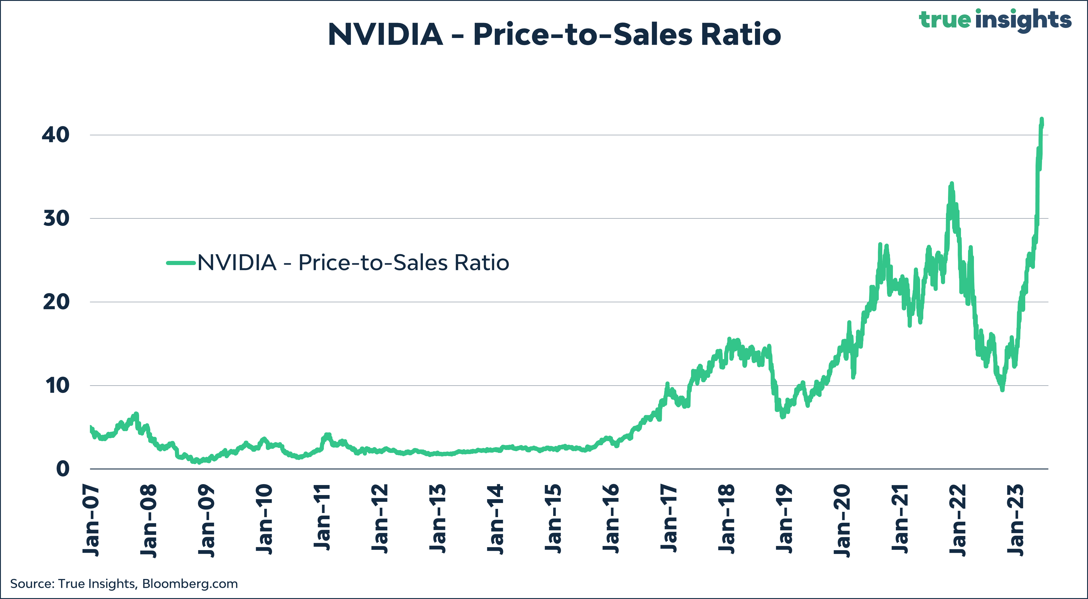
Is Artificial Intelligence (AI) driving the next ‘Dot Com’ bubble? Focusing just on (social) media headlines will make you think that. Market concentration has reached its highest level ever, and NVIDIA consistently stirs markets as it trades at an astounding price-to-sales (not earnings) ratio of 40. This means it would take a staggering 40 years to recuperate your investment, assuming zero costs while generating those sales, no taxes, and all sales distributed to the investor.
However, assuming that we are in a bubble solely based on the valuation of individual stocks does not make much sense. In that case, we would forever be in a bubble. In today’s Daily Insight, we explore various valuation metrics for the Global (MSCI World IT) and US Technology (MSCI US IT) sectors, as well as the broader market (MSCI World and MSCI US Index), both during the peak of the Dot Com bubble and at present. In addition, we look at company earnings and sales growth now and then to discover if and how much the two periods are alike. Finally, we compare stock market performance.
P/E Ratios
We focus on P/E ratios based on realized earnings, as reliable forward earnings data for the Dot Com period are unavailable. The chart below reveals that current P/E ratios for Global and US Technology stocks stand at an elevated level of 35. Strikingly, these are far from the levels witnessed in 2000. By the way, P/E ratios also soared during 2002-2003, 2010, and 2020-2021, but these spikes are primarily associated with recessions when earnings (the E) collapsed or became negative for many companies.

Turning to the broader markets, the valuation of the MSCI World and MSCI US Index looks less stretched, significantly deviating from the levels observed during the Dot Com bubble.
CAPE Ratios
Looking at Cyclically Adjusted P/E (CAPE) ratios based on 10-year real earnings data presents a picture similar to regular P/E Ratios. The current valuation of the Technology sector is very elevated, leaving zero margin for error. The CAPE ratios of the MSCI World and US indices are significantly lower than those of tech stocks. Nevertheless, compared to their history, these CAPE ratios are somewhat elevated as well.

Price-to-Sales Ratios
When we incorporate sales into the equation, the valuation perspective changes substantially.
The present Price-to-Sales Ratios are extremely elevated. In fact, the Price-to-Sales Ratio for the MSCI World IT Index currently exceeds the levels witnessed during the entire Dot Com Bubble phase. The Price-to-Sales Ratio of the MSCI US IT Index is very rich too.

Moreover, the broader market’s Price-to-Sales Ratio is also inflated. Both the ratio of the MSCI World and the MSCI US Indices currently surpass their peak ratios observed in 2000.
Compared to other valuation metrics like P/E Ratios, eyebrow-raising Price-to-Sales Ratios have become a key characteristic of this market cycle. This is likely due to a combination of strong pricing power and the massive wave of inflation, resulting in rapid sales growth, which investors are (wrongfully) extrapolating.
Price-to-Book Ratios
Price-to-Book Ratios fall in between P/E Ratios and Price-to-Sales Ratios. These ratios are historically high, although not as extreme as during the 2000 period.

Bubble Performance
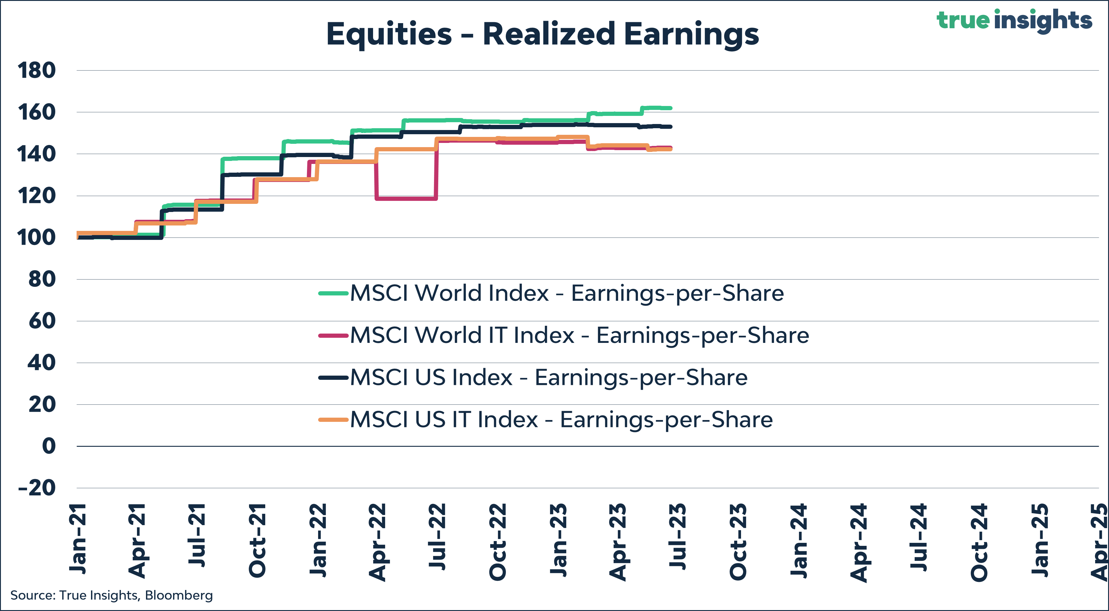
Next, we look at aggregated company performance. The chart below displays the growth in earnings-per-share for the four indices in our sample throughout the build-up, duration, and bursting of the Dot Com Bubble.
Between 1998 and April 2020, which marked the peak of the bubble in terms of valuation, earnings grew impressively at a rate of 15% to 22% per year. This pre-bursting growth likely fueled the frenzy in markets. The chart also reveals the impact of the bubble’s pop, with technology earnings collapsing and causing a significant bear market that affected the broader indices.

Interestingly, if we consider January 1st, 2021, as a starting point beyond the aftermath of the Covid crisis, company earnings have grown at the same pace as they did between 1998 and April 2000. Once again, this remarkable earnings growth of 15% to 22% allowed investors to extrapolate recent trends too far into the future, leading to the elevated valuation levels we see today.
Sales
Due to the limited availability of daily data, the chart below appears somewhat ‘funny.’ Still, the annualized sales growth for MSCI US and US Technology stocks between 1998 and April 2000 was roughly 6%. Interestingly, Global Technology stocks outperformed, with sales growth exceeding 10% per year. This likely explains the presence of four non-US tech companies among the top 10 largest firms in April 2000.

However, recent sales growth looks a bit different. US Equities, including both the broader market and Tech stocks, have achieved sales growth of over 12% annually, while the sales growth of the MSCI World and MSCI World IT indices has been approximately 8%.

But what is more important is that while these sales growth rates are pretty solid, they are not, or not much, better than back in April 2000. Therefore, the current elevated Price-to-Sales Ratios raise legitimate concerns and suggest the presence of a bubble, like they did in 2000.
Prices
We focus on returns in the final part of this ‘Bubble’ analysis. The chart below reveals the performance of Global Technology stocks between 1998 to April 2000 and from June 2020 until present. Given the forward-looking nature of equity markets, we start comparing from June 2020 rather than 2021. As the chart shows, the current price performance looks nothing like that of the Dot Com bubble, during which tech stocks soared by more than 250%.

The same holds for US Technology stocks then and now.

Conclusion
The valuation of Global and US Tech stocks is currently at an exceedingly high level, not far off the highs witnessed during the Dot Com Bubble. Moreover, the Price-to-Sales and Price-to-Book Ratios indicate that current valuation levels either match or surpass those seen during that period. Although a lot can happen in the short term, these valuation levels do not bode well for long-term returns. This is underpinned in the chart below, comparing the Cyclically Adjusted P/E Ratio for Global Technology stocks against the rolling 10-year annualized returns.

As for the broader markets in our analysis, the MSCI World and MSCI US Index, valuations appear less stretched, but certain metrics like the Price-to-Sales Ratio still indicate elevated levels.
While the performance of technology stocks does not resemble the rapid ascent witnessed during the 2000 Dot Com period, the downside risks are similar. The likelihood of a Q1 2024 US recession remains high. Additionally, the outlook for earnings is unfavorable, as our bellwether earnings-per-share indicators point to a significant decline. This is particularly concerning for a sector that has become increasingly cyclical due to its reliance on advertising income.
Should market Sentiment turn, Technology stocks may easily correct by 20%. This is far less disastrous than during the bursting of the Dot Com Bubble but represents a clear divergence with investors happy to join ‘the party’ willing to pay very heavy multiples while doing so.