MACRO MARKET INDICATORS
An update of our Macro Market Indicators, which tell you something about future asset class returns.

Investing is not about Macro story-telling. Instead, below is an update of our Macro Market Indicators, Macro Indicators that actually tell you something about future asset class returns.
Real Rates above 2%? Buy Bonds and Gold, Sell Equities
We start this month’s Macro Market Indicators section with real yields. In addition to our recent insight, we add the price of Gold to the mix.
We calculate 1-month to 12-month future returns on stock, US Treasuries, and gold following days when the 10-year real yield closed above 2%. We calculate the change in basis points to determine the impact on the Fed Target Rate and the real yield. We assess absolute returns and changes. In addition, we compare them to returns and changes measured over ALL 1-to-12-month periods, regardless of whether the 10-year real yield was above 2 The results are presented in the table below.
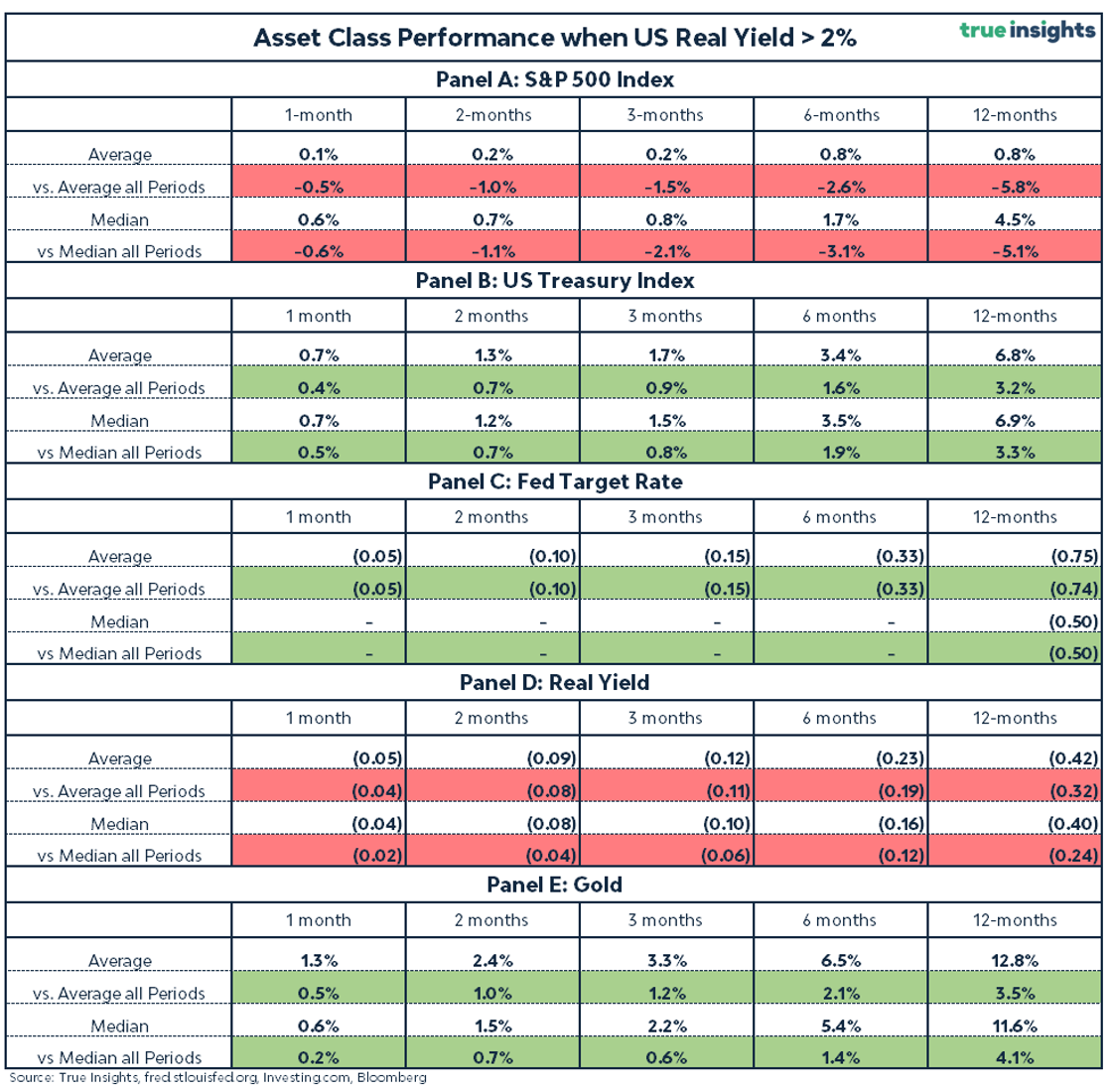
Buy Bonds!
Panel B of the table shows the average and median returns on the US Treasury Index following 10-year real yields of 2% or higher. Both the average and median returns on US Treasuries are positive for each period from 1 to 12 months.
More importantly, the realized and median returns following 2% or higher real yields were considerably higher than the average and median returns measured over all 1-to-12-month intervals.
For example, in the six months following a real yield above 2%, US Treasuries yielded an average return of 3.4%. This is 1.6% higher than the average returns on US Treasuries measured over all three-month periods, including those when the real yield was not above 2%.
Sell Equities!
For the S&P 500 Index, we observe the opposite trend. While the average returns in 1 to 12 months after a 10-year real yield of 2% are positive, they are significantly lower than the average and median returns measured over all periods.
For instance, on average, the S&P 500 Index delivered a return of only 0.8% in the six months following a real yield of 2% or higher. This is 2.6% lower than the average six-month return for all 6-month periods.
Buy Gold!
Let’s move over to gold, shown in panel C. The results confirm the strong relationship between real yields and gold performance. Since real yields tend to fall once they rise above 2%, gold realizes strong returns both in absolute terms and relative to its performance measured over all 1- to 12-month periods.
For example, gold realized a positive return of 6.5% six months after the 10-year real rate hit 2% or more. This is 2.1 percentage points more than the average return measured over all six-month periods.
The Fed Will Stop
Based on the historical changes in the Fed Target Rate following real yields of 2% or higher, Powell will likely end the current tightening cycle.
On average, the Fed Target Rate decreased in the months following a real yield north of 2%. For the median change, this only holds for the 12-month period. This is unsurprising since the Federal Reserve frequently keeps the Target Rate unchanged. The most common (median) change is, therefore, zero. However, the average suggests the Fed’s bias is towards lowering rates.
Yields Down
Lastly, the 10-year real yield also tends to decrease after reaching a 2% or higher level.
For example, on average the 10-year real yield decreased by 23 basis points six months after the real yield closed above the 2% threshold. This underscores the significance of this 2% threshold as an economic inflection point.
It’s worth noting that the difference from the change in the real yield measured over all periods is smaller than those 23 basis points. This confirms the trend already shown by the first chart that, on average, the 10-year real yield has decreased over time.
A final word
it is important to realize that real yields above 2% have become extremely rare. We have to go back approximately 15 years to find the last occasion. Using break-even (inflation) rates, we extend the ‘official’ daily 10-year real yield series from the Federal Reserve, starting in 2003, back to 1998. Yet, this still covers a relatively short and specific period, reducing the results’ statistical power. However, monthly data, for which a longer history is available, is unsuitable as this series ‘misses’ most observations.
ISM Manufacturing
Cross-Asset Return Estimates
The table below presents the latest update of our ISM Manufacturing – Implied Returns analysis. As we argued last month, equity markets needed a miracle from the ISM Manufacturing Index to erase significant downside. This hasn’t happened, and equities have dropped across the board.
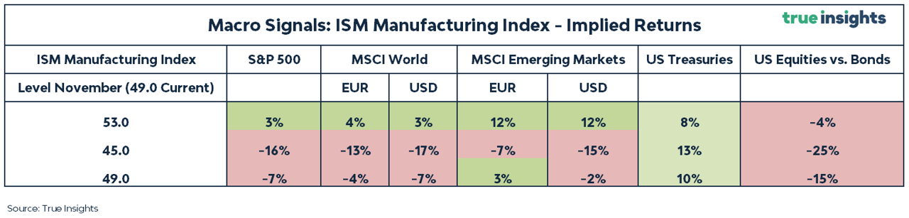
Key takeaways:
In general, the uptick in the ISM Manufacturing and the decline in stock prices finally brought some ‘green’ (upward potential) back to our ISM – Implied Returns analysis.
· If the ISM Manufacturing Index remains at 49 between now and November, more pain for equities is to be expected.
· If this becomes a ‘false move’ in the ISM, and we head back to 45, ample downside risks await us.
· But if the ISM Manufacturing continues to improve and reaches 53 in the next couple of months, upside for all equity market indices emerges.
· Yet, since bond markets are following equities on their way down, history suggests even bigger gains for US Treasuries, even when the ISM Manufacturing catapults higher to 53.
Financial Conditions
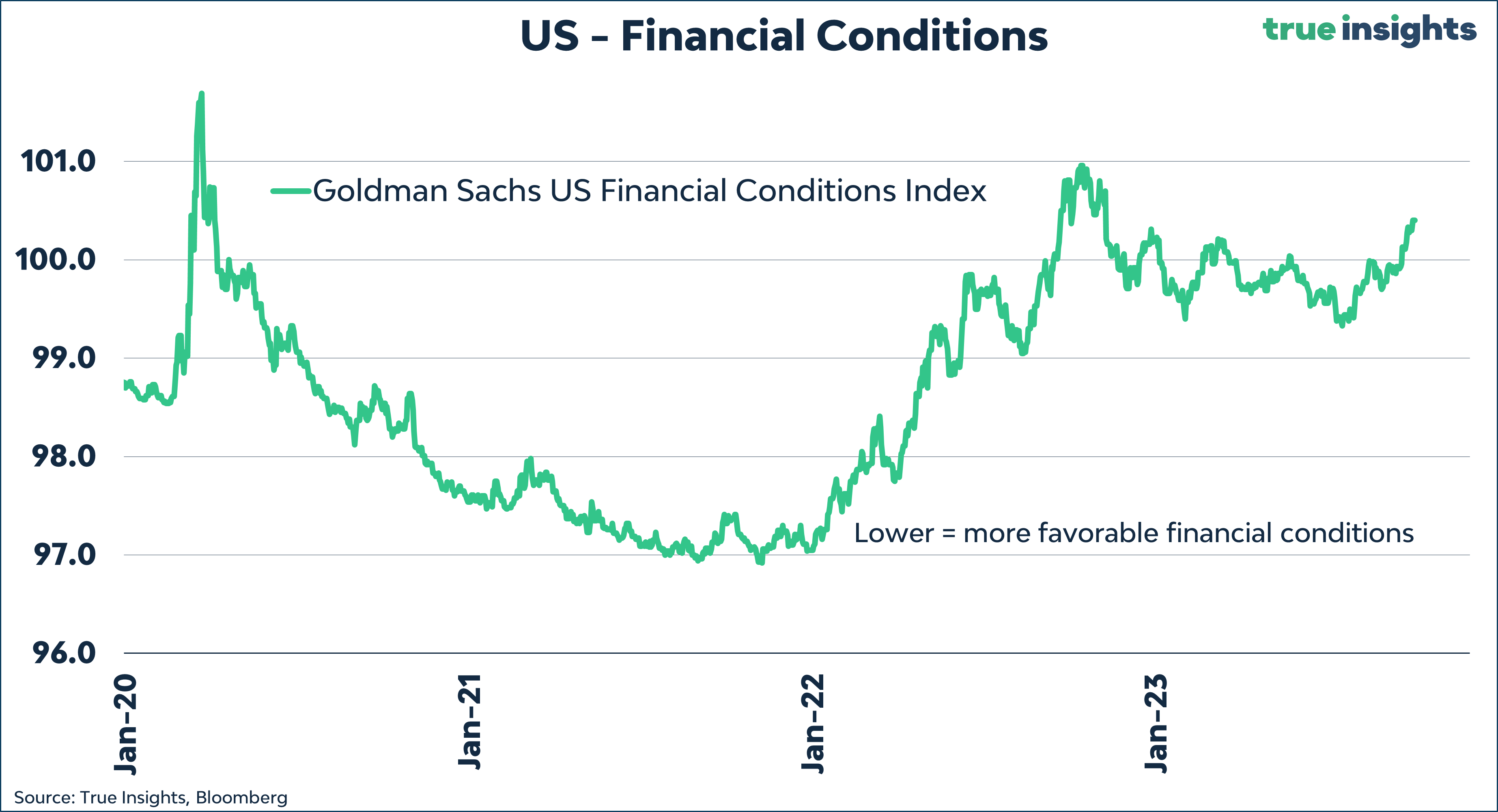
The table below shows the implied returns for different asset classes linked to three scenarios for financial conditions. A higher level of the Goldman Sachs US Financial Conditions Index means tighter conditions and vice versa.
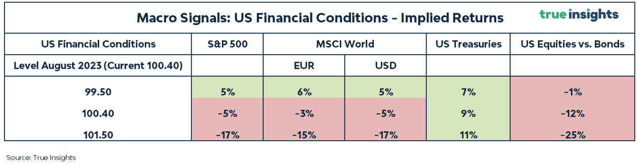
Key takeaways:
· Contrary to our ISM analysis, Financial Conditions now bring less green to the table for equities.
· After tightening significantly from the previous month, financial conditions must improve to provide any upside for equities.
· Instead, most upside resides in Treasuries, which have collapsed despite financial conditions worsening. Historically, the exact opposite happened.
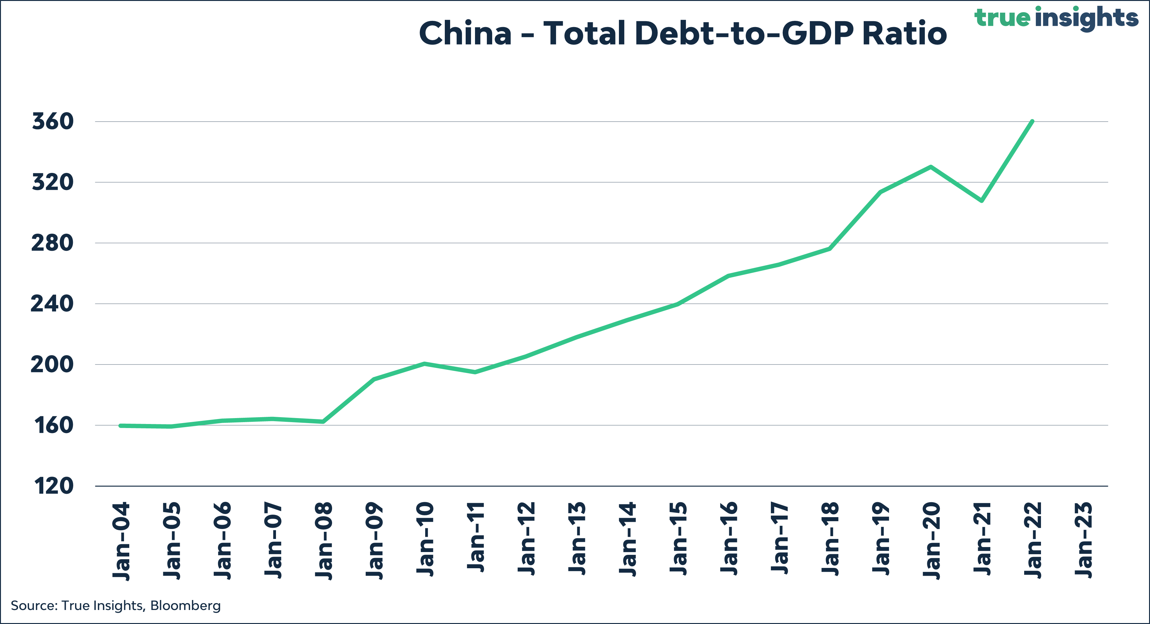
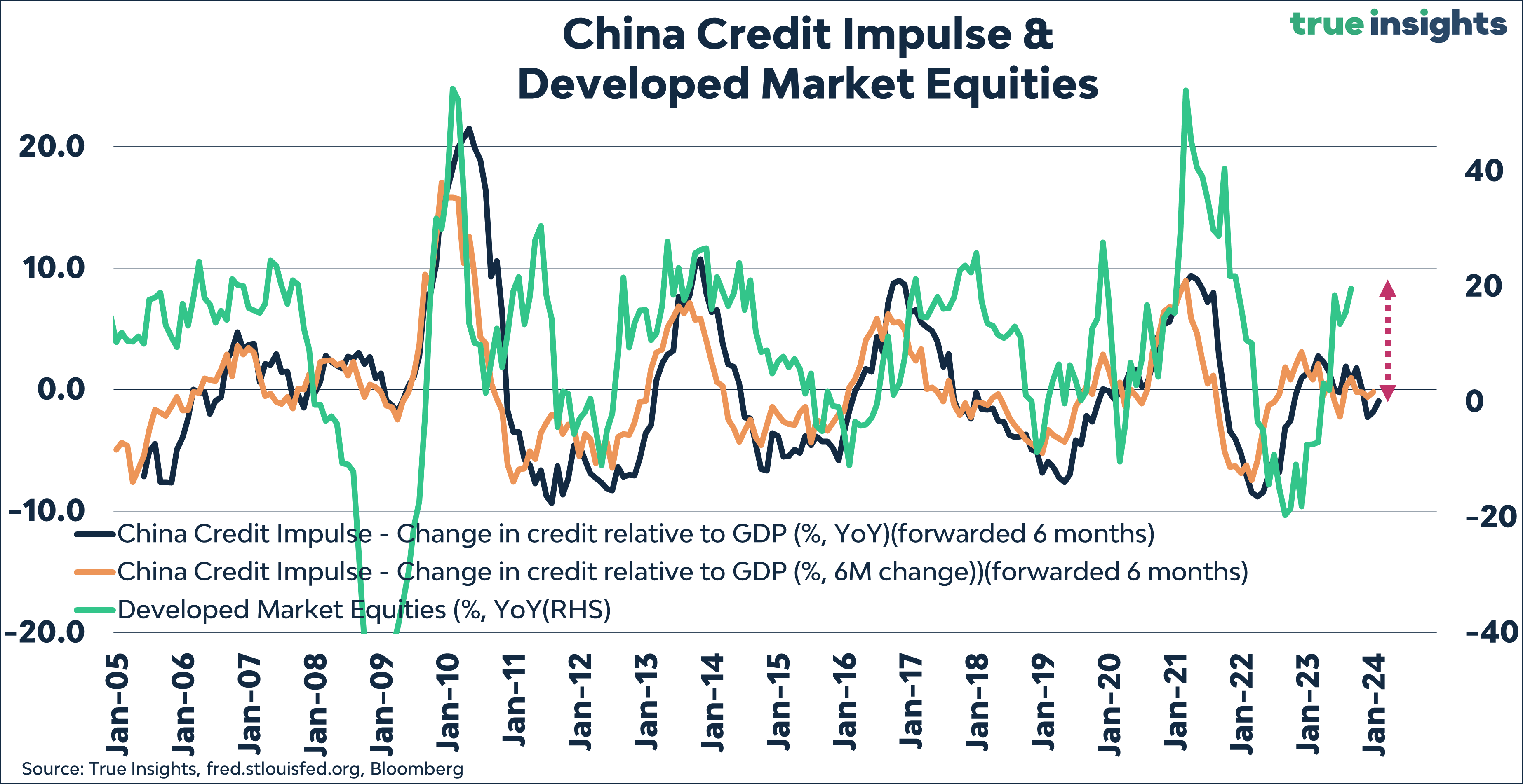
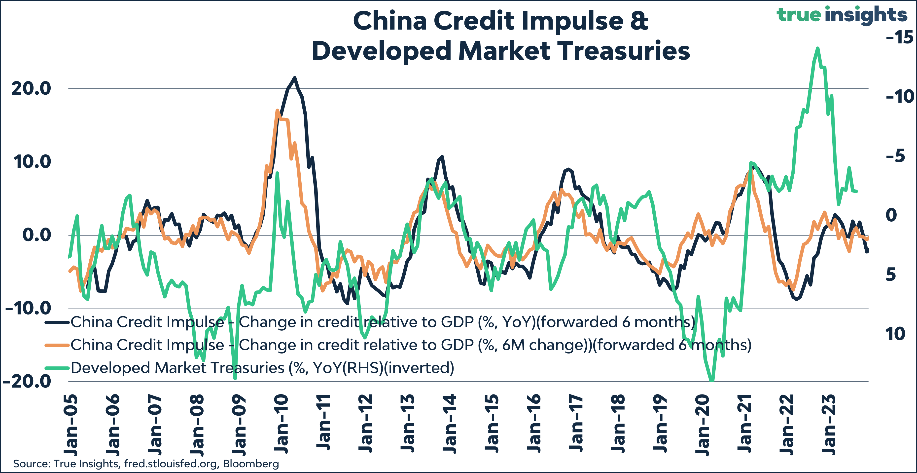
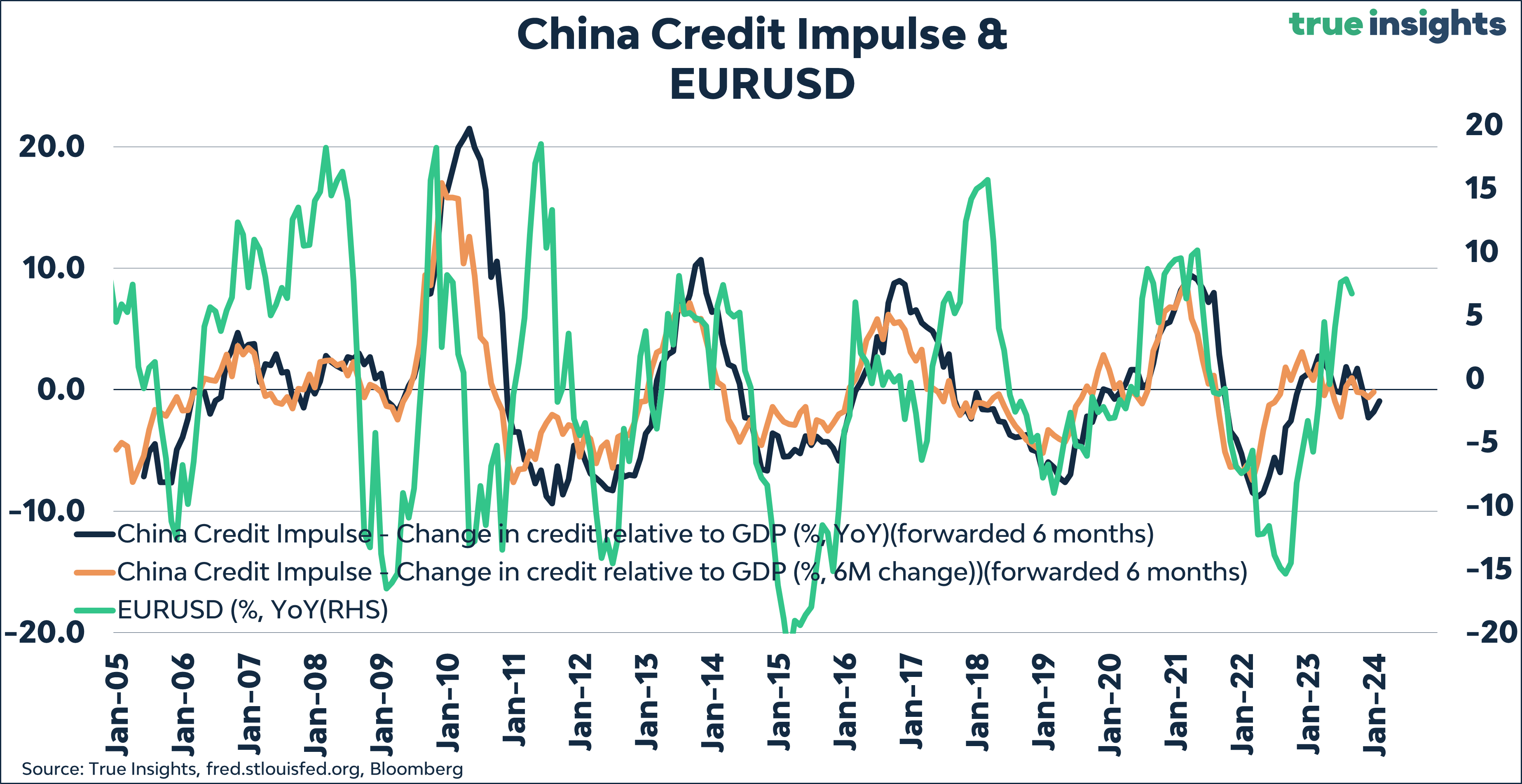
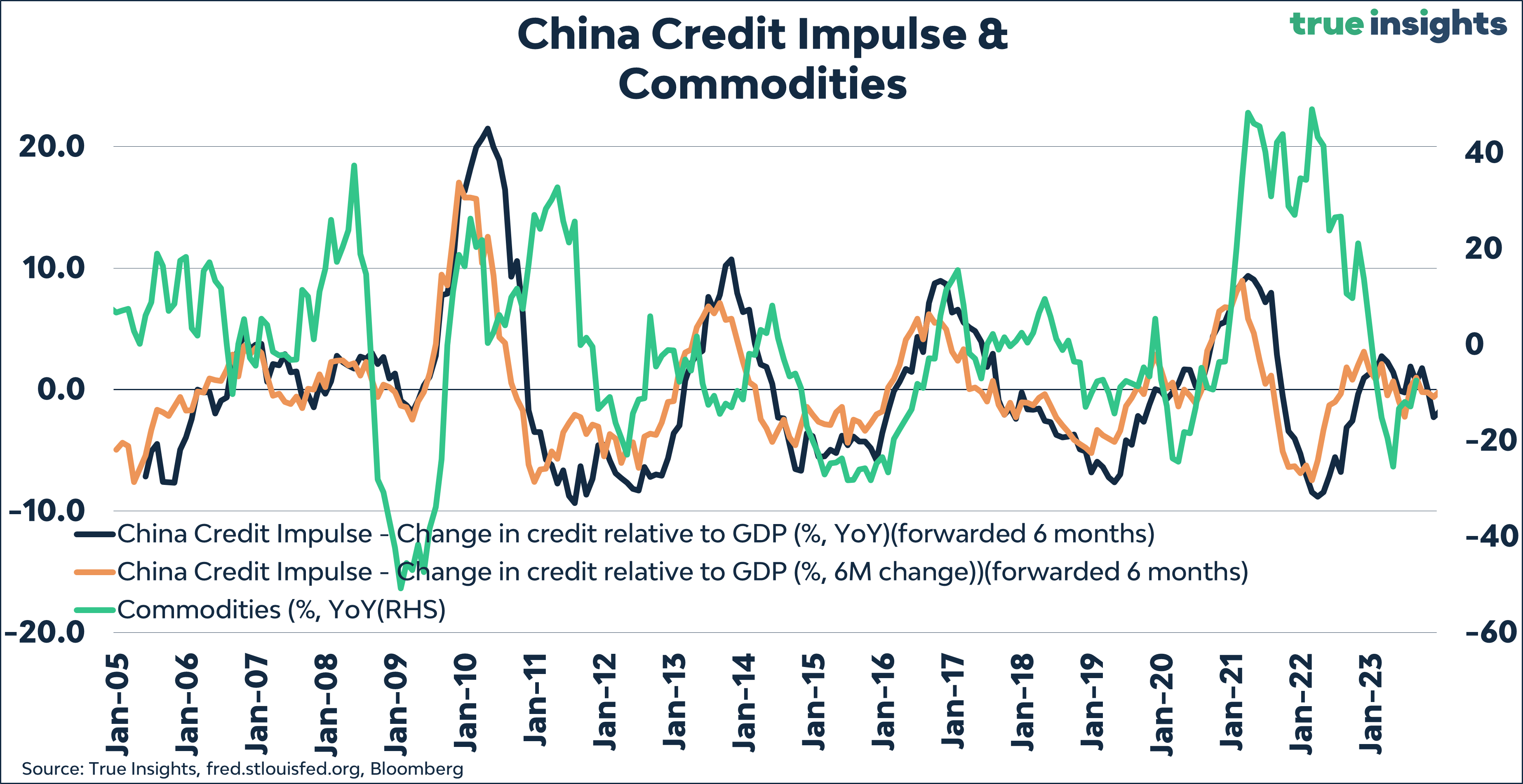
Credit Impulse
As mentioned in the China section, a country burdened with a rapidly rising debt load - total debt-to-GDP is heading to 400% - has less room to stimulate itself out of debt issues. Consequently, China’s credit impulse remains uninspiring.
Developed Market Equities
While the gap between stock performance and the Chinese Credit Impulse has narrowed, the signal remains negative. Even if stock prices remain at their current levels this month, the gap will not be closed.
Treasuries
Unsurprisingly, the Chinese Credit Impulse continues to push towards Treasuries, which continue to decline. The upside potential is significant should the trend in bond yield reverse.
Euro
The Chinese Credit Impulse points towards maintaining our short euro (long US dollar) position. Based on the credit impulse, there is room for another five percentage points decrease.
Commodities
Commodities are perfectly aligned with the Credit Impulse despite the recent increase in oil prices. As highlighted previously, the price of copper is declining, which increases the likelihood of a US recession.
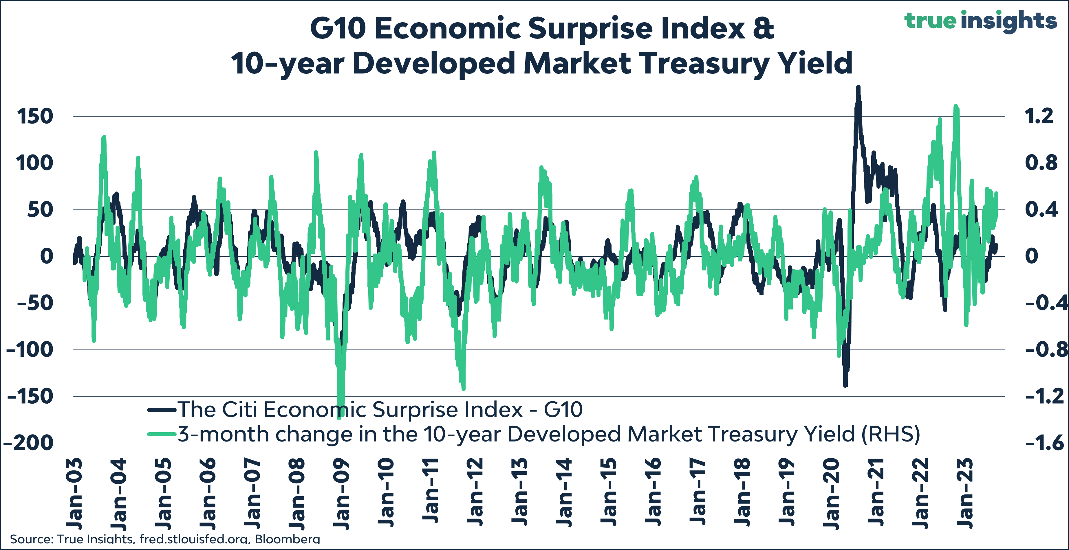
Surprise Indices
Global Macro Surprises are marginally positive, while equities are down in the last three months. Yet, the divergence between the two is relatively small.
This cannot be said of the spiking bond yields, which are way ahead of economic surprises.
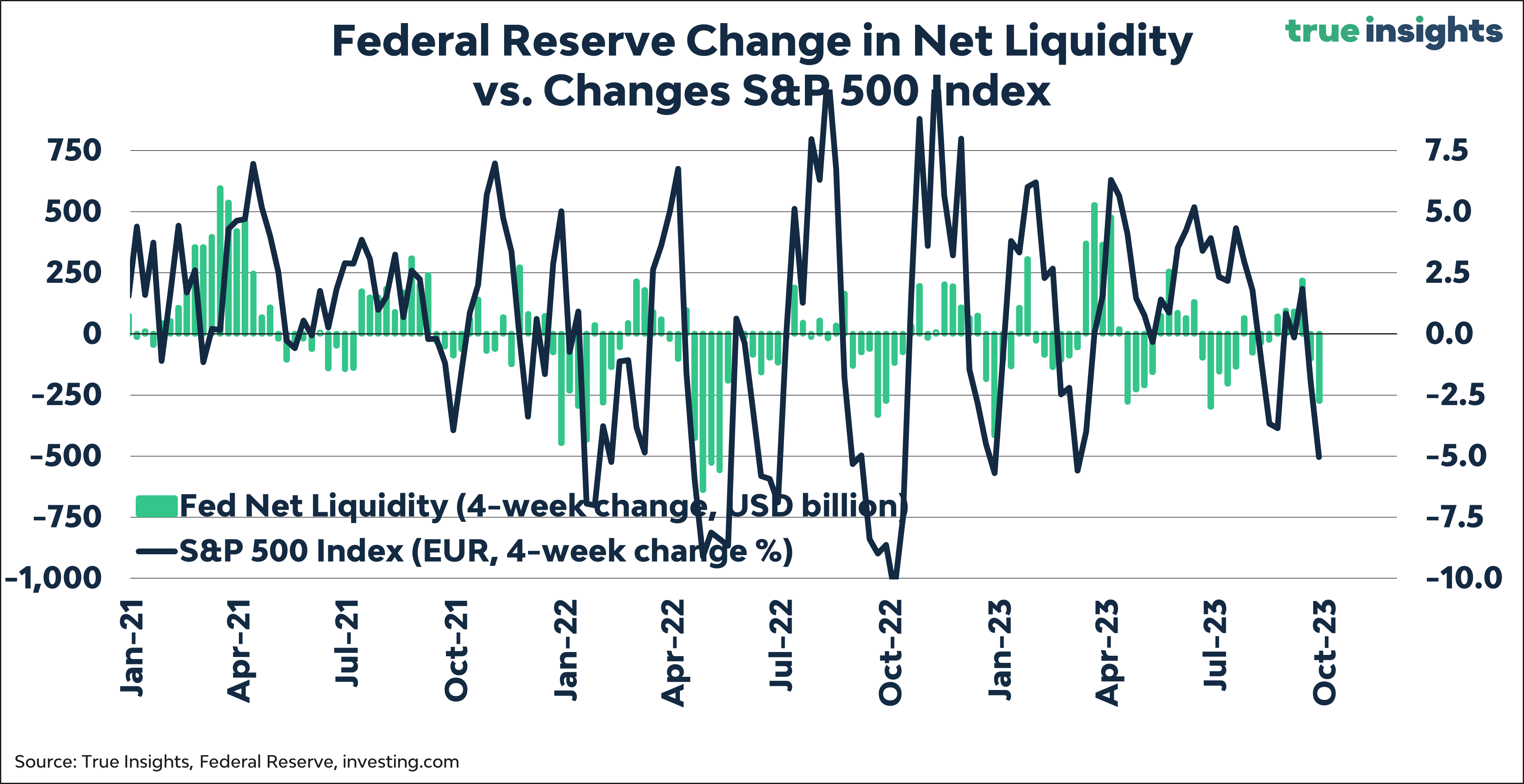
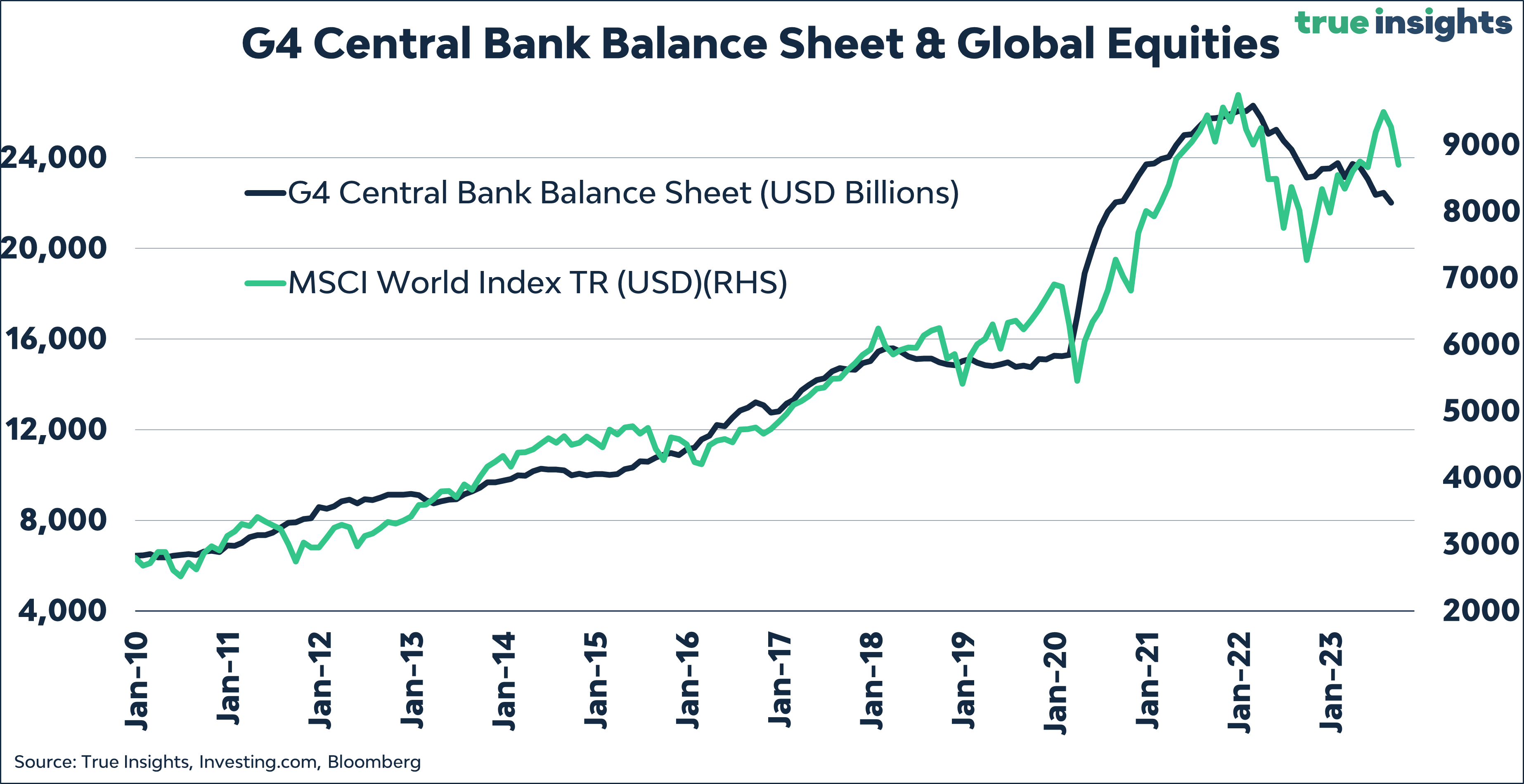
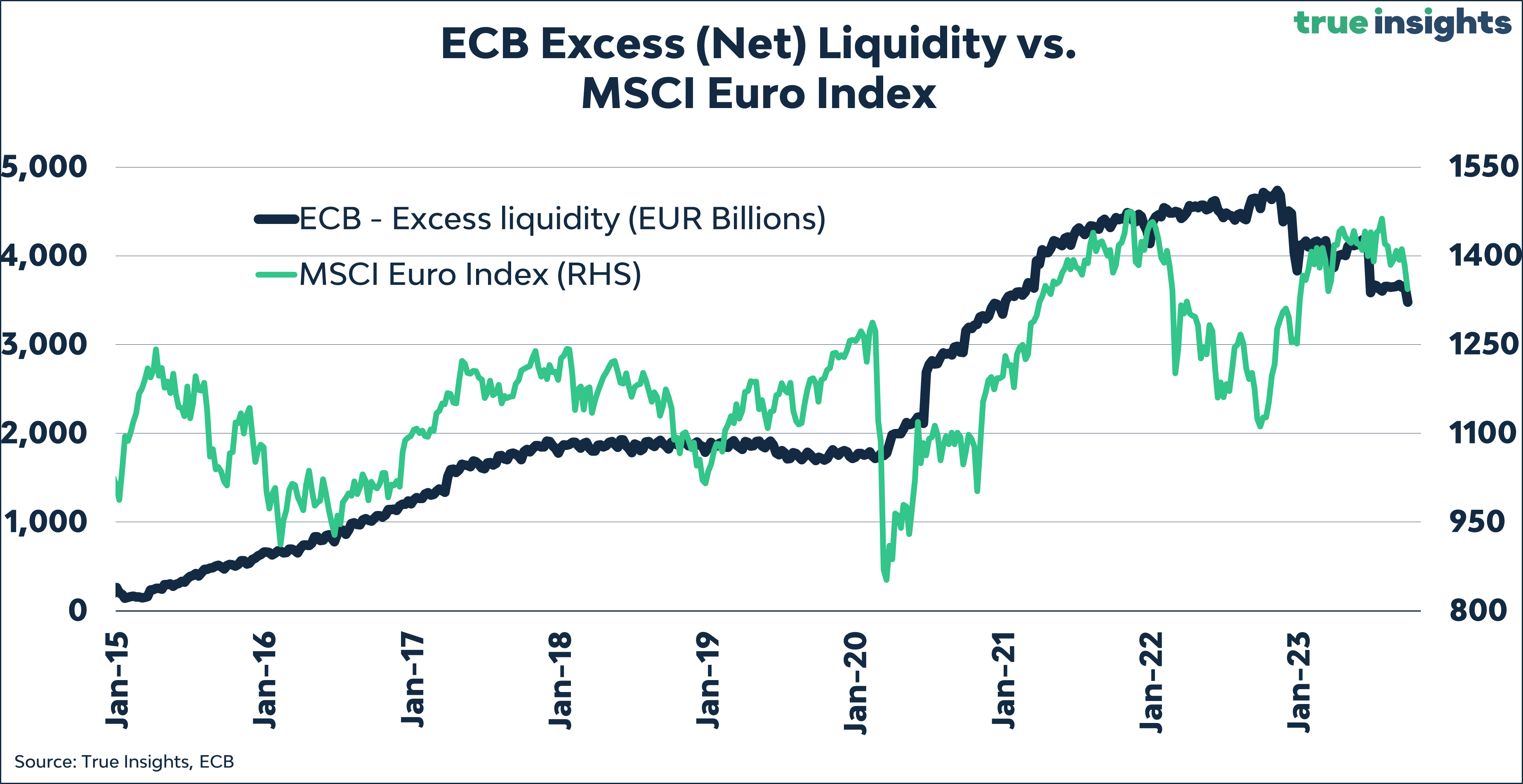
Central Bank Liquidity
Investors are nearly myopically focused on whether there will be more rate hikes from central banks. But with Powell, Lagarde, and others sounding increasingly reluctant to do so, central banks have stepped up Quantitative Tightening efforts.
- Central Bank Balance sheets continue to decline
- Net Liquidity is deteriorating in the Eurozone
- As well as in the United States
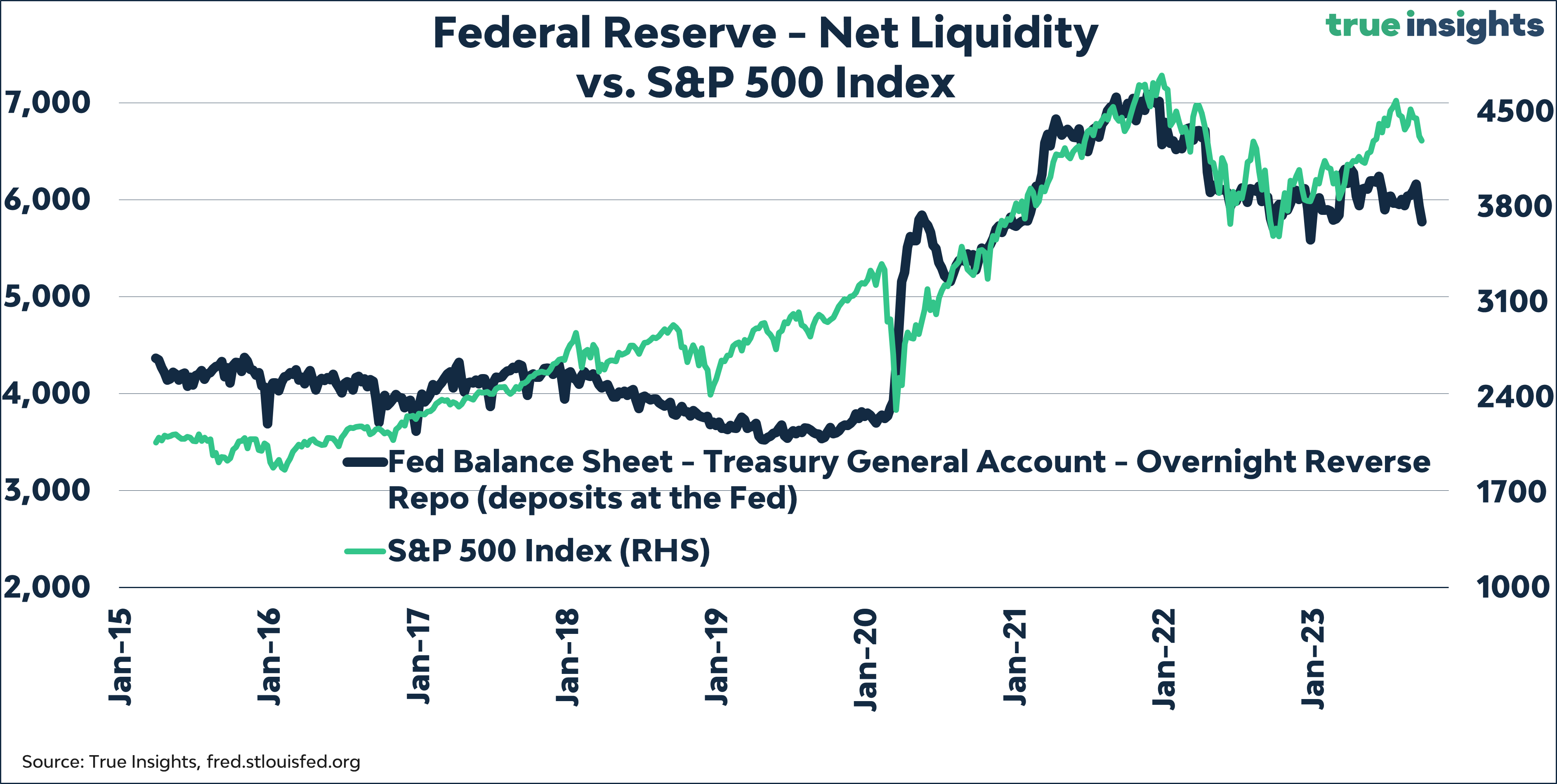
- Less liquidity results in declining equity prices