
The Weekly Market Monitor – Gold Bugs, Debt Bubbles, and Volatility Bites
The Weekly Market Monitor – Gold Bugs, Debt Bubbles, and Volatility Bites
Gold makes fresh highs as debt balloons on. Will volatility strike with a vengeance?

First things first! – Another all-time high for gold

This week, the price of gold surged past USD 2,300 per Troy Ounce for the first time. This isn’t necessarily because Western investors are rushing in en masse. Generally, ETF holdings of gold are seen as a good proxy for demand from Western investors. However, the data suggest a stabilization amidst an outright negative trend.

It’s important to consider that investors might also purchase gold directly (OTC) to store at home or in a vault. Last year, OTC demand significantly increased.
For now, the Chinese central bank (less affinity for the US dollar) and Chinese consumers (distrust in Chinese real estate) are driving the price upward. The question arises: what would happen if ETF demand were to increase (as demand often follows price), real interest rates were to decline, and irresponsible fiscal stimulus were to continue unabated? More on this below.
What do you mean by changing the narrative?
The argument remains peculiar that a different narrative supposedly backs each gold price rally. Why? It seems to me that it’s consistently the same story, only in more extreme forms. Every crisis sees governments responding with larger fiscal stimuli, increasingly managed by central banks. This process has accelerated since the Great Financial Crisis of 2008/2009.
Focus on market cap
The rising gold price is certainly exciting despite the vocal skepticism from gold bears. However, market capitalization is just as crucial, if not more so.

With a real-time market cap of around USD 17 trillion, gold is one of the only asset classes, alongside real estate, that can compete with bonds, which I believe are becoming structurally less attractive.
The real-time market cap is also a key variable in my valuation methodology for Bitcoin.
MACRO
Stocks, which way, if any way?
Although stocks have experienced a modest 2% “correction,” they have largely remained stagnant over the past few weeks, refusing to undergo a significant decline. This is notable following a rally of more than 20%, during which several stock indices were frequently “overbought.”
Several macro factors are at play:
Government’s continued excessive fiscal stimulus.
Central banks’ eagerness to lower interest rates.
Improved economic growth momentum.

3.66 trillion
Starting with the first macro impulse: government spending. Nearly every day, a media outlet confirms that the United States adds roughly USD 1 trillion to its national debt every 100 days.

As written in an X post:
“The US accumulates USD 1 trillion in debt roughly every 100 days. That equals USD 3.65 trillion (3.66 this year) or nearly USD 11,000 for every American annually. With total debt at USD 34.5 trillion, the US adds more than 10% of debt per year.
Yes, you should consider GDP. But even with strong growth, the budget deficit will again exceed 6%.
Yes, you should account for inflation. But at 3.2%, the US is far from inflating its debt away.
Yes, that debt represents an asset, too. But what is the quality of that asset, its volatility, downside risk, and diversification benefit? And who wants to own it?”
Vive la France
Other countries are just as problematic as the US. France recently announced it would exceed its already exorbitant budget deficit of 4.9%, projecting a 5.5% deficit for 2023. The silver lining is the French Finance Minister’s conviction that by 2027, France will meet the 3% standard. But is this believable?

Even though Italy is performing better than France regarding budget deficits, forced by the European debt crisis of 2011/2012, the situation remains dire. With a budget deficit of 7.2% in 2023, Italy is now attempting to get its affairs in order by 2026. Short-term, the effect of these expenditures is clear: economic growth is artificially pushed higher through debt. And yet, the Eurozone economy is barely growing.
Let’s start now!
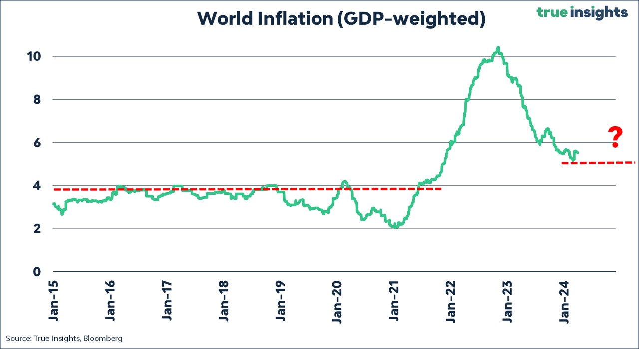
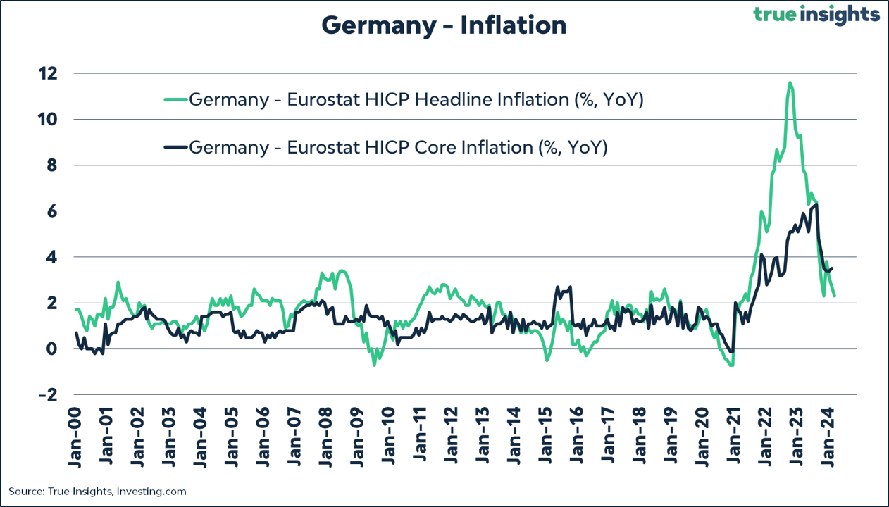
Global inflation remains nearly two percentage points above the pre-COVID average. Price increases in the service sector remain high, confirmed by Germany, which, like the Eurozone as a whole, reported lower-than-expected inflation figures.
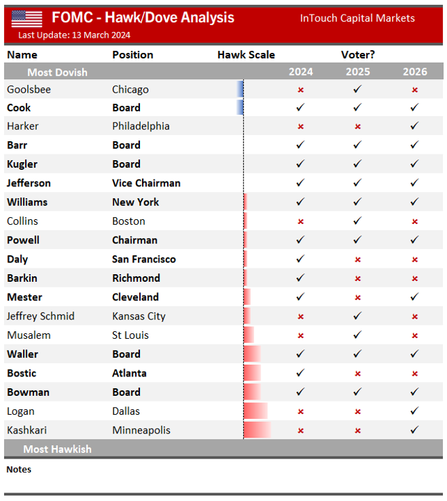
Despite his hawkish colleagues Waller and Kashkari (who is not voting on the FOMC but did manage to sink the S&P 500 Index) making clear they are in no rush to lower interest rates, the Fed Chairman reiterated nearly the same narrative in his speech as during the last FOMC press conference. He also stated that recent inflation figures did not “materially change” the overall picture.
Like Powell, the ECB is keen to start lowering interest rates. The ECB minutes revealed that ‘The case for considering rate cuts was strengthening.’ However, they also noted that April had yet to provide enough new data.

Switzerland then? Is it different?
Economists and investors who claim that Switzerland is different when it comes to cutting rates, because its inflation is at 1.15%, are lacking historical perspective. Since 2009, Switzerland has reported an average inflation rate of 0.3%, while the Eurozone has reported an average of 2.0%. The gap is 1.7%. The current Eurozone inflation is at 2.40%, meaning the gap between Eurozone and Swiss inflation is smaller than the average (1.25%).

In any case, the direction of central banks must be welcome news for risky assets like stocks and Bitcoin.
No landing, soft landing, economic momentum, it’s all there.

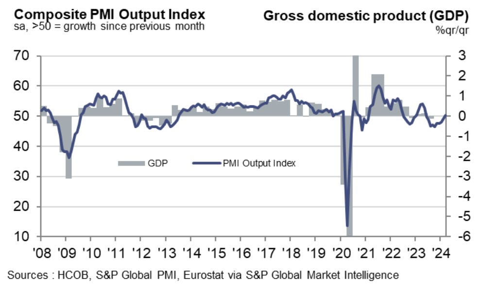
With US excess savings depleted, the most likely scenario for the US economy remains a soft landing, with still some chance of a recession. Globally, improvements can also be seen. For instance, the Eurozone Composite PMI rose above 50 for the first time since May 2023.
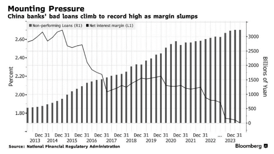
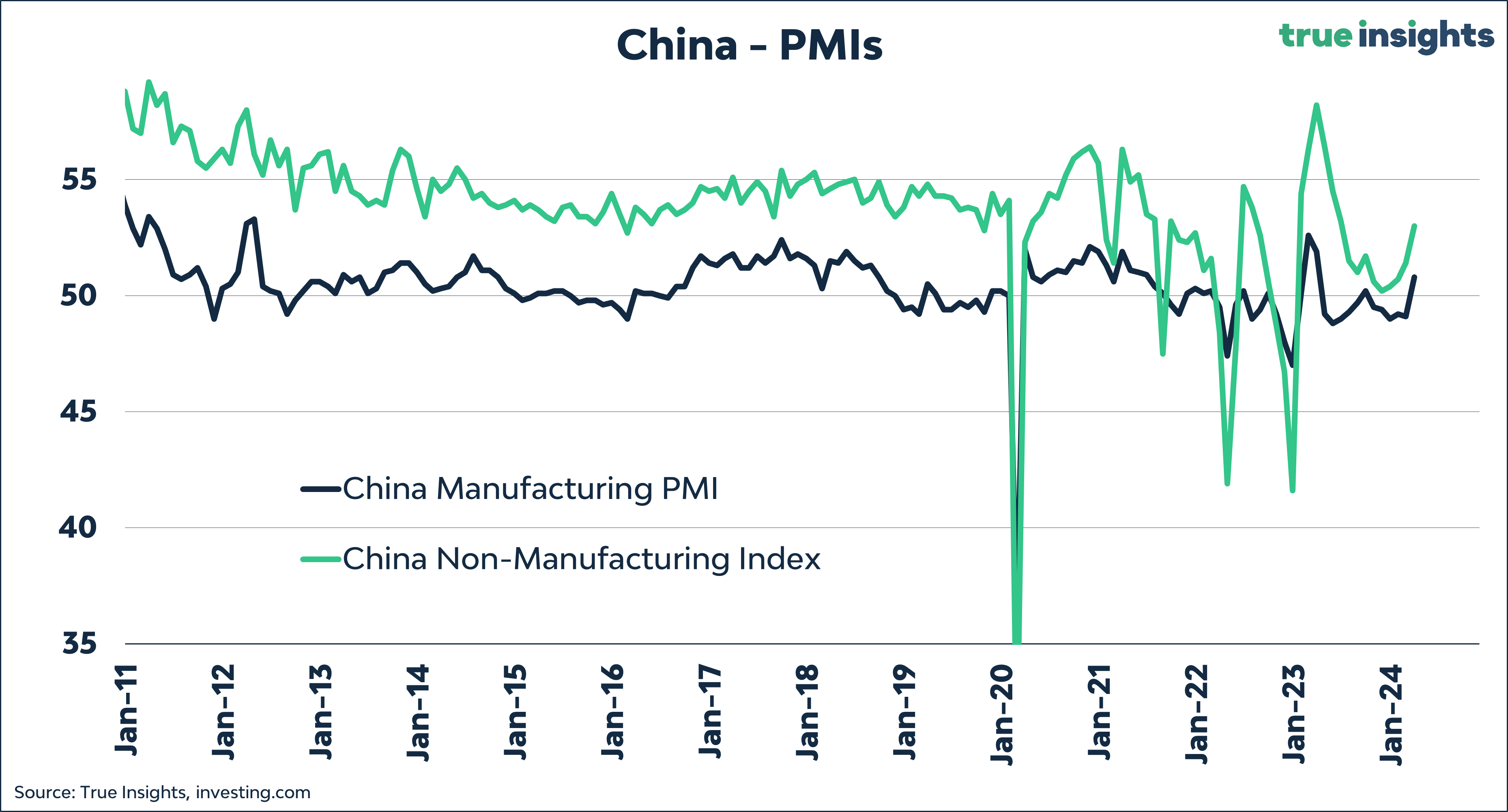
China – the exception
What happens when you force banks to refinance bad loans from real estate developers and to lend more to debt-laden Local Government Financing Vehicles? This results in a specific banking chart.
Yet, even in severely damaged China, some improvement is noticeable, with PMIs for both services and manufacturing being prime examples.
SENTIMENT
Which volatility to watch?
The MOVE Index, which measures the implied volatility of the US bond market, has dropped to a 2-year low. The reason is straightforward: the strong alignment between markets and the Federal Reserve. I had the pleasure of speaking with Jamie McGeever from Reuters this week, stating: ‘If uncertainty about the Fed evaporates, confidence creeps back in. The ‘soft landing’ views align, bond volatility falls, and investor sentiment rises.’ You can find Jamie’s article on bond volatility here.

However, we must not forget that bond volatility, relative to stock volatility (VIX Index), remains relatively high even though it has risen significantly in recent days. As previously indicated, I expect this to continue, especially as long as governments continue spending like there is no tomorrow. Concerns about debt sustainability, long-term yields, and diversification benefits underpin this.
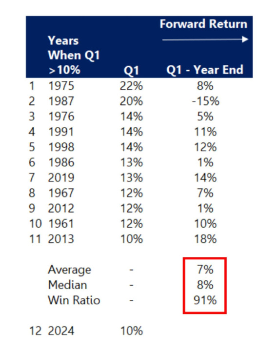
Great quarter = great year?
Since 1975, the S&P 500 Index has risen more than 10% in the first quarter 11 times. On ten occasions, stocks continued to rise for the rest of the year. That’s a hit ratio of 91%, with an average increase of 7%.
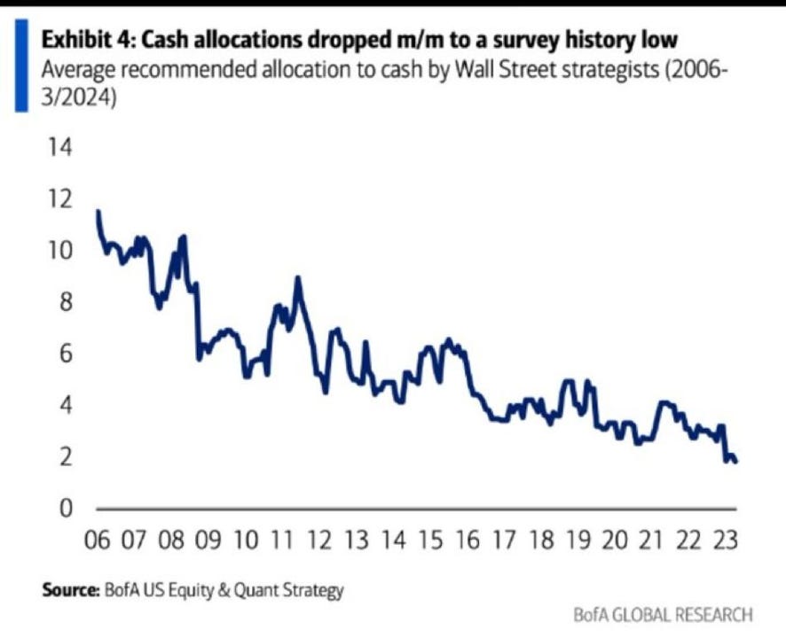
Running out of cash!
Opposite the strong Q1 return, investors’ positioning looks less upbeat. The cash position of Wall Street strategists has fallen to a historically low level. This means that ‘buying the dip’ can no longer be financed with cash. Therefore, funding must come from other asset classes. Once interest rates begin to fall, bonds could gradually become the source. And what about the astronomical size of money market funds? The Federal Reserve could prevent a real correction with a simple press of the interest rate button.
VALUATION
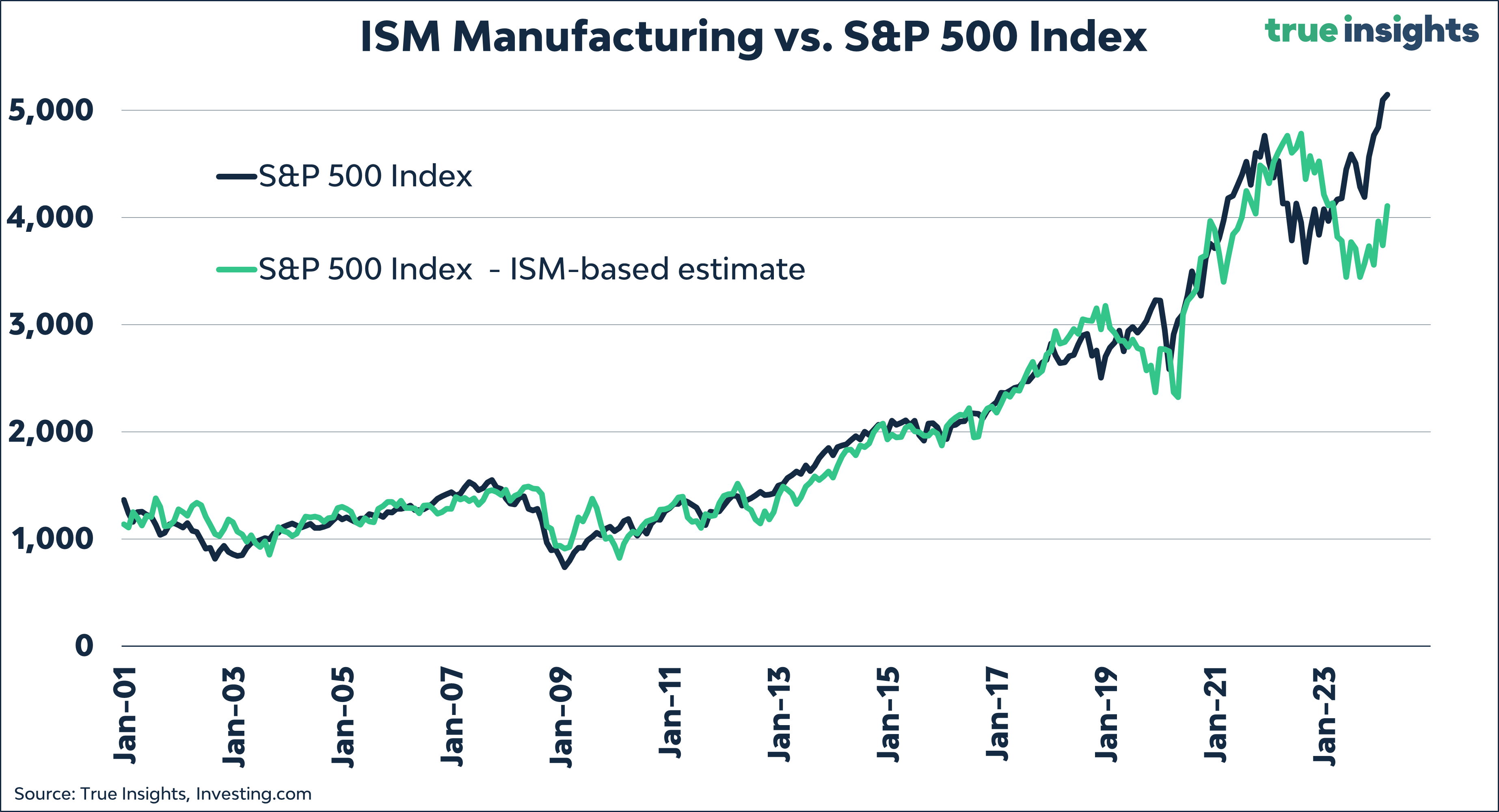
ISM Issue
The ISM Manufacturing rose for the first time since September 2022, which will please the bulls. However, there’s still a 20% downside following the historical relationship with the S&P 500 Index. So, even though a ‘Powell put’ is in place, I would not completely disregard the ISM.
Magnificent earnings!
In recent weeks, I have regularly posted about the outperformance of Magnificent 7. Below is a piece from my earlier post:
The Magnificent 7, on their own, are no reason to exit stocks. To illustrate, I’ve calculated the S&P 500 Index returns one to six months following the top 5% of days since 1990 when the S&P 500 Index demonstrated the strongest 6-month outperformance compared to the S&P 500 Equal Weighted Index. Meaning, how did the broader S&P 500 Index fare up to six months after already significantly outperforming the Equal Weighted index?

The results, shown in the green bars below, are crystal clear! The S&P 500 Index continues to excel, at least up to six months following a period of significant outperformance over the Equal Weighted Index. Returns from 3.0% in one month to 15.3% in six months surpass the ‘normal’ historical returns for these periods by a considerable margin.
A pronounced outperformance of the S&P 500 Index over the Equal Weighted Index is not a signal to exit stocks. Quite the contrary!
However, it is important to note that while the S&P 500 Index achieved above-average returns after outperforming the Equal Weighted Index, the latter showed even more impressive results. The Equal Weighted Index outperformed in every return period we examined – ranging from one to six months.

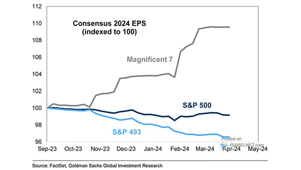
Having said this, something to watch is the concentration of earnings. Earnings per share (EPS) growth is also entirely dominated by the Magnificent 7, which could limit the broadening of the rally.
ENJOY YOUR WEEKEND!
JEROEN
MARKETS
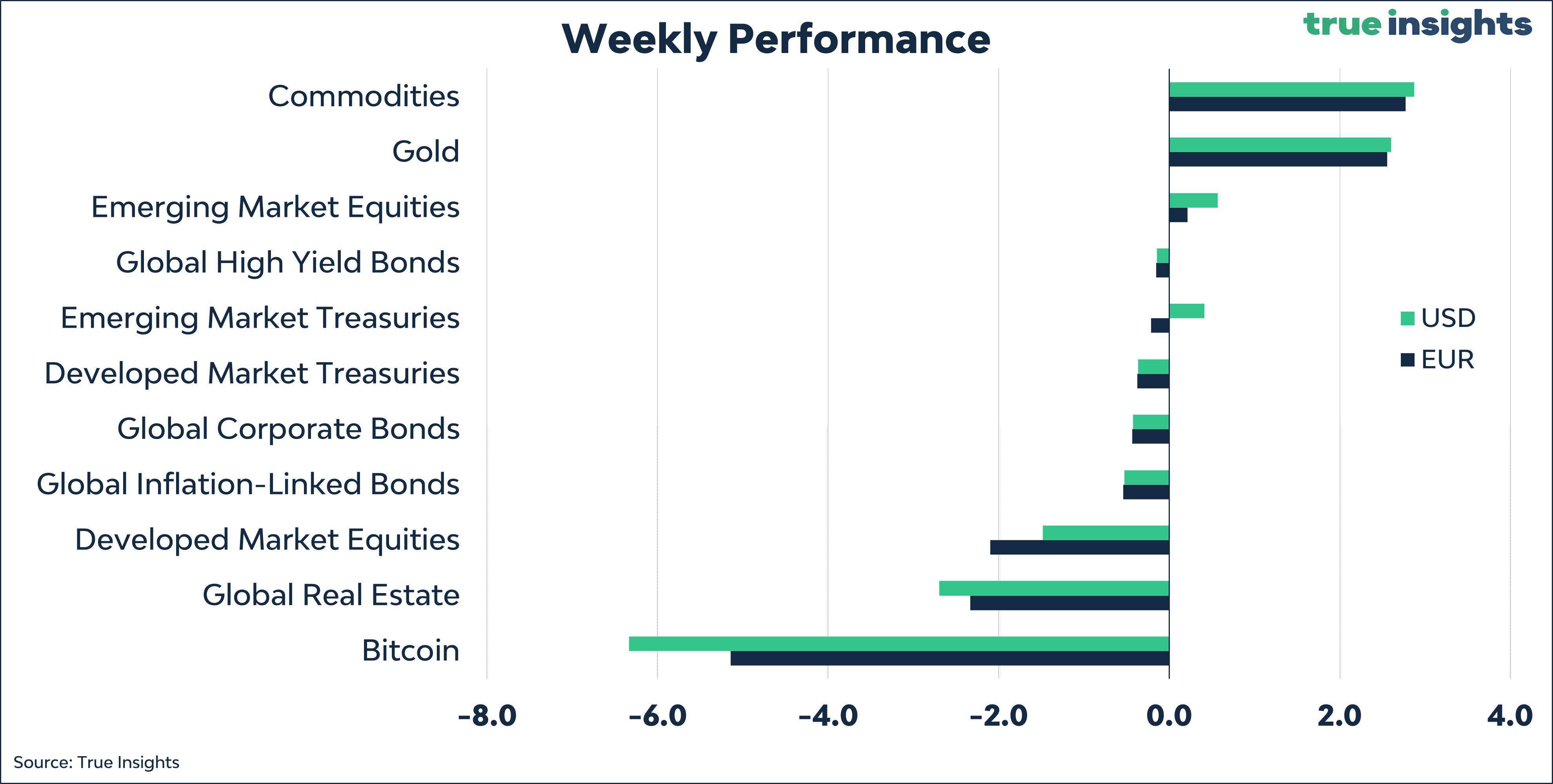
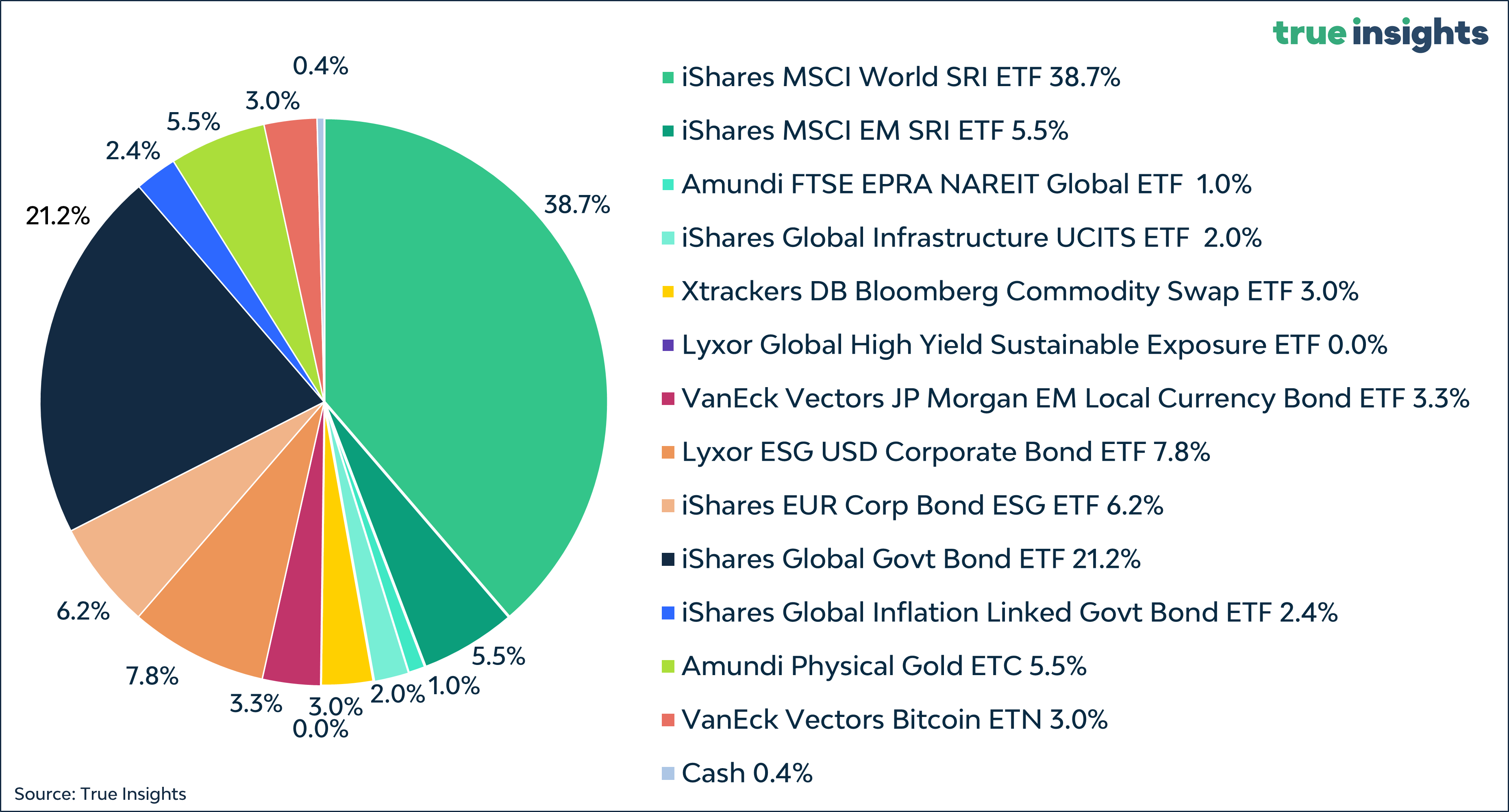
Active Weights
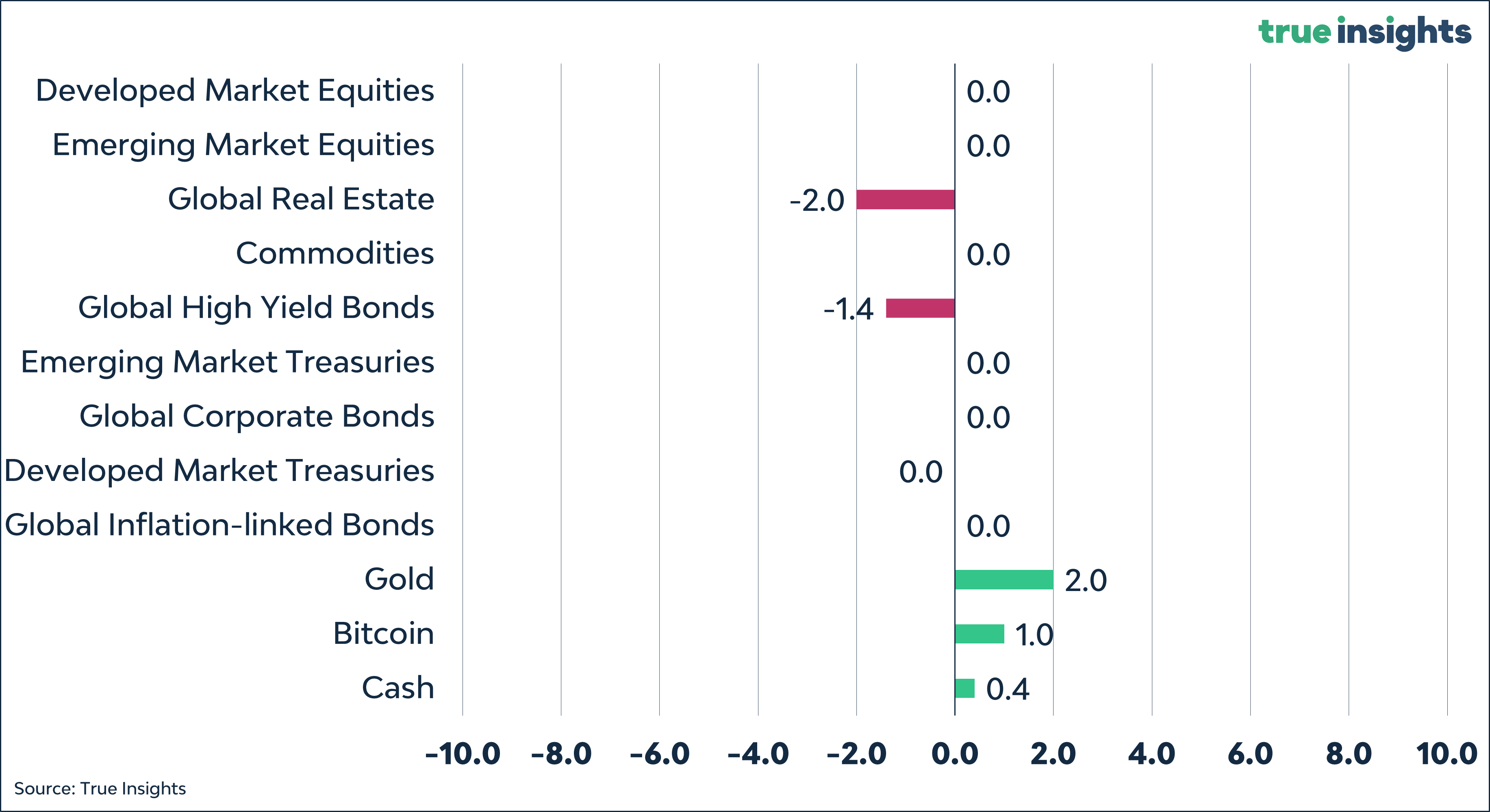
Balanced Portfolio